Medical Mobile
Website Design
Turn more website visitors into patients.
In November 2016, mobile and tablet use of the web exceeded desktop use for the first time in history, and the trend continues up to this day.
https://www.clio.com/
Today, current research indicates that more than 70% of website users now access online content via their mobile devices. Consequently, the significance of implementing a mobile-responsive design for your medical practice’s website cannot be overstated. Such a design not only elevates the user experience but also boosts your website’s SEO and fosters growth.
Advantages of Mobile Responsive Website Design for Medical Practices
Connect with potential patients anytime, anywhere.
From the smallest smartphone to the biggest desktop. On every browser from Chrome to Safari to Firefox. All screen shapes and sizes. Your website needs to look good and work well on the most used device options.
Achieve higher rankings in mobile search results.
Websites with a mobile responsive design are prioritized in search rankings by Google and other search engines. So having a responsive design for your medical website will help your SEO efforts. Since an increasing number of people are using mobile search, ranking higher in mobile search results pages (SERPs) can result in more traffic to your website and more patients.
Turn more website visitors into patients.
A strong mobile-friendly website design is easier for potential patients to use and more visually appealing. These attributes are far more likely to result in converting website visitors into patients. When your website is designed with mobile in mind, potential patients will be better able to find the information they are looking for as well as find it easy to contact you.
A better experience for users.
While it is always important to consider how search engines will view your website, SEO shouldn’t be prioritized ahead of user experience when it comes to design. You can have the best-ranking website in your industry but still never convert a single user if your site is slow to load and difficult to navigate.
Our Medical Mobile Web Designs Include These Features


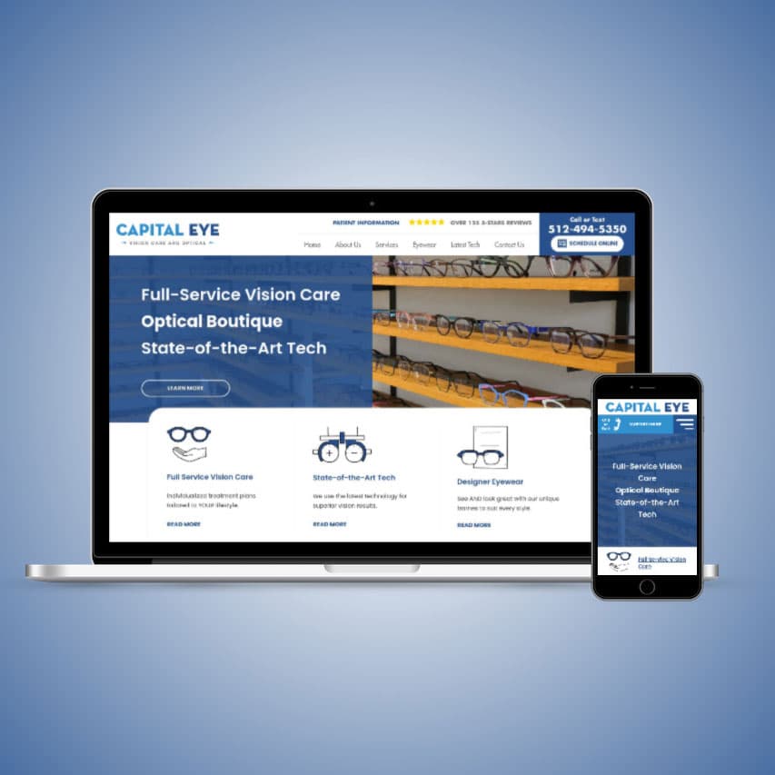
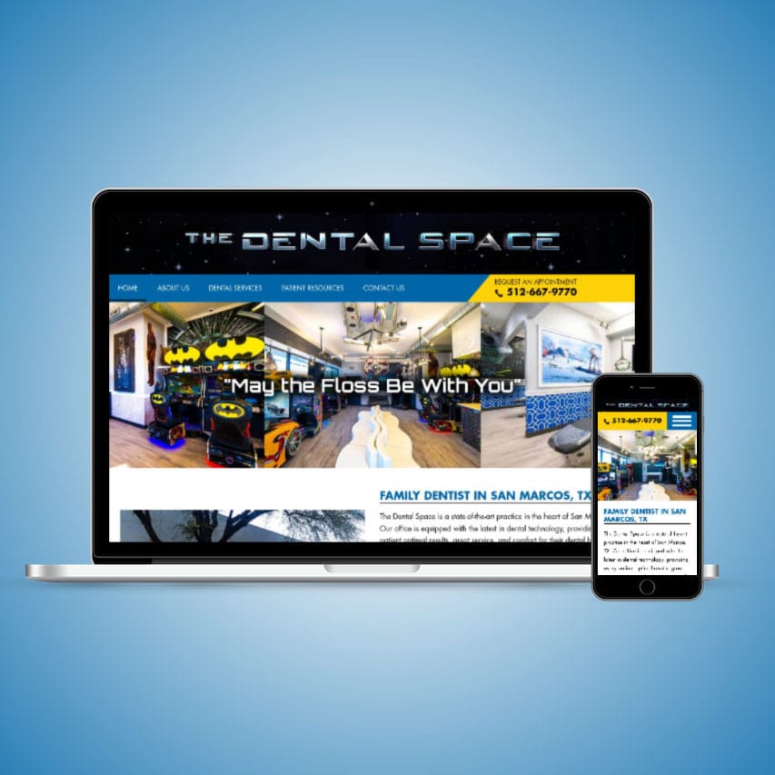
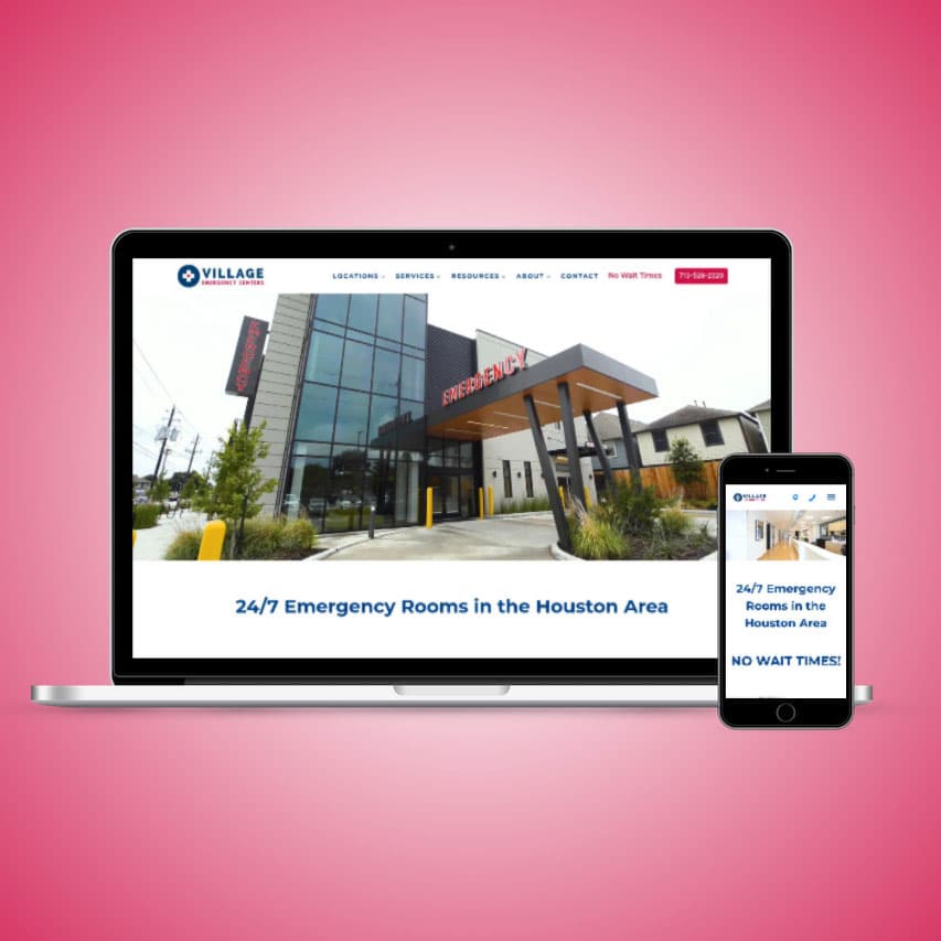
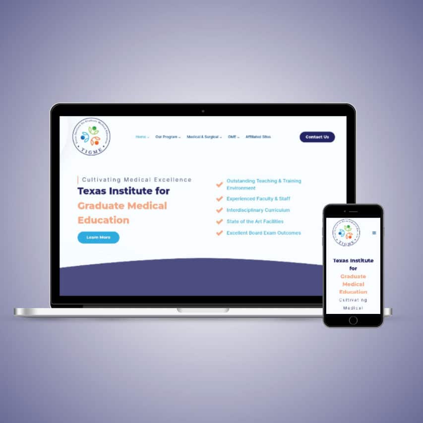
Our Medical Website Designs
Check out some of our recent work for our clients.


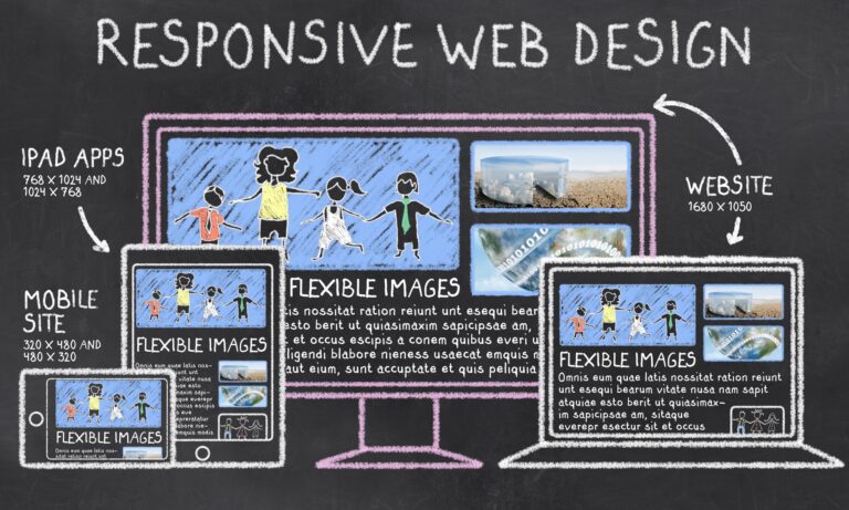
Compare the Mobile and Desktop Versions of Healthcare Websites
Comparing the mobile and desktop versions of your website is a critical step in medical website design. When you look at how your website appears across a range of sizes in devices and in different browsers, it helps to ensure you are creating a consistently great experience for users. Because the number of users accessing the web on smartphones and tablets, mobile responsive design must be a priority. However, just because a website looks great on an older Android phone doesn’t mean it will look the same on the latest iPhone or a Samsung table. This can apply to any brand or size of device and different browsers as well.
Mobile vs Desktop Differences and Why They Matter
Websites for medical practices, when viewed on phones, should be easy to use and navigate, resembling simpler versions of their desktop computer counterparts. Although the computer version might display many large pictures, some of these details might be left out on the phone version to make sure it loads quickly. By understanding these differences and what they mean, medical practices can create websites that work well on phones, share important information, and leave a good first impression on potential patients. Highlighting easy access, clear information, and helpful features like chat options and contact info can make the experience on phones even better.
Testing the Mobile Responsiveness of Your Medical Website
- Enlist the help of family and friends. If you’re uncertain about how well your medical website works on mobile, just get in touch with a few close friends and relatives and request them to check out your site on their PCs, tablets, or smartphones. Should they spot any problems, ask for a screenshot and specifics about the browser, device, or operating system they were using. This info can be invaluable for a tech expert trying to resolve the issue. By looking at both the mobile and computer views of your site, you can guarantee it presents itself well and offers useful content to everyone, no matter the device they use.
- Leverage site analytics. With the vast array of devices and browsers on the market today, it’s challenging to ensure a website displays correctly on all of them. By utilizing tools such as Google Analytics, you can gain insights into the visitors on your website. This data can guide you on which screen dimensions, browsers, and more to prioritize when refining your mobile website experience.
- Review often. A single browser update can disrupt your site’s adaptability. It’s wise to periodically review the functionality of your key pages across various devices and browsers throughout the year.
Market Share for Top Browsers in 2022:
Market Share for Top Operating Systems in 2022:
A Note on Website Emulators
You may have heard of a tool called an Emulator. These let you check how your website looks on a range of devices, screen sizes, operating systems, and browsers. Emulators are typically a paid service, and while helpful, we’ve found that the accuracy is sometimes lacking.
Mobile Responsive Website Design Services
Our services for mobile-friendly website design encompass more than just aesthetic enhancements for mobile viewing; we also fine-tune the site’s speed and overall performance for a smooth user journey. Ensuring a medical practice’s website adapts well to mobile devices allows it to connect efficiently with potential patients, granting them effortless access to crucial details like the practice’s specialties, patient feedback, contact data, and beyond.
Re-Designing an Existing Medical Website to Be Mobile Responsive
Is your current website displaying identically on both desktop and mobile? Transforming your existing medical website to be mobile-responsive is crucial in this era of tech-literate patients. This guarantees easy access on all gadgets, from smartphones to tablets. Adapting your site for various displays improves user experience and meets the needs of the growing mobile audience. A responsive design also elevates your search engine presence. With our Custom Medical Website Design Service, the mobile interface will mirror the aesthetics and functionality of the desktop version.
Begin at the Beginning: Build a Mobile Responsive Medical Website from the Ground Up
When crafting a fresh mobile-friendly website for a medical practice, it’s essential to captivate and connect with potential patients. Apply adaptive design strategies to tailor your site for different devices, guaranteeing ease of access for everyone. Embed top-notch visuals and intuitive navigation to uplift the user journey. By starting fresh, you can lay the foundation for a site that’s inherently mobile-optimized. This sets a positive initial impression and delivers crucial information to potential patients.
Our Mobile Website Design Process
When you choose to optimize your medical practice website for mobile responsiveness, the transformation entails several crucial phases.
- Initial Consultation – We start by pinpointing your distinct needs and objectives. This involves understanding the primary features and tools you envision for your website.
- Design Collaboration – Now you join forces with our dedicated web design experts who specialize in medical website aesthetics. Together, you’ll craft a site that’s both visually captivating and intuitive, resonating with your clinic’s ethos.
- Development – After finalizing the design blueprint, our crew dives into the construction phase. Here, they convert your design concept into a live, operational site, incorporating codes and adaptive design principles. This ensures your website fluidly adjusts to diverse screens and gadgets.
- Quality Assurance & Refinement – This stage is dedicated to rigorous testing for functionality, speed, and adaptability across multiple devices and web browsers. We solve any glitches or irregularities found to promise a hitch-free user journey.
- Go Live – With the site polished and primed, it’s time to unveil it to the public. But the work doesn’t end here. Regular website updating and maintenance are vital to ensure your website remains up-to-date and functions seamlessly.
Let Us Help With Your Medical Mobile Website Design
A mobile-responsive website is no longer just an added bonus for medical practices — it’s a requirement. It’s vital for delivering a top-notch user experience and ensuring potential patients can effortlessly reach your services on their chosen devices. With a mobile-responsive layout, there’s no hassle of juggling separate sites for desktop and mobile, streamlining upkeep and cutting down costs. While transitioning to a mobile-responsive design comes with its set of challenges, the enduring advantages significantly eclipse the upfront effort. As the tech landscape shifts, staying updated and ready for future trends is key. If you’re set to bolster your online visibility and draw in more patients, our healtchare web developers can help. Get in touch with us now!
What Our Clients Say
Trusted By Doctors Nationwide


Ready to Grow Your Business?
Whether you have no website or a website that needs a boost in search engine rankings, WE CAN HELP!