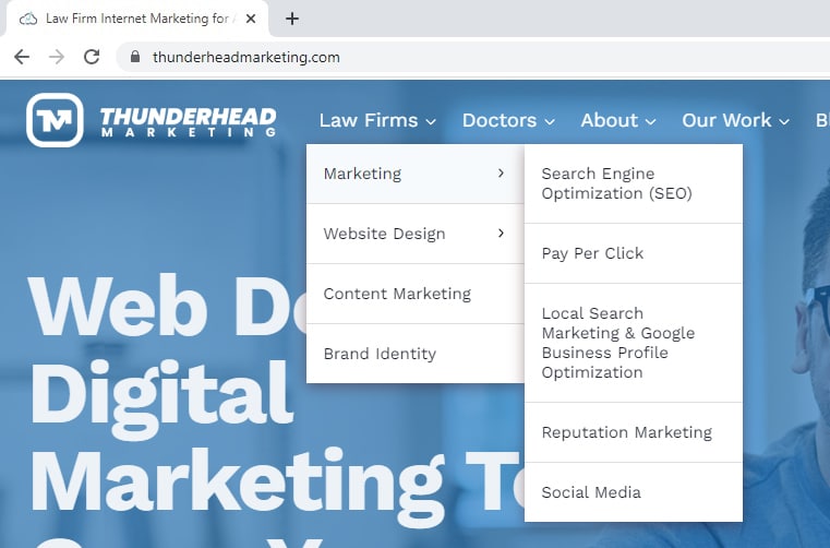

No matter how much some of us may miss the good old days before smartphones took over the communication world, there’s no denying the fact that mobile devices have become an integral part of our lives. From staying connected with loved ones to browsing the internet for information, most of us are inseparable from our phones.
According to recent data, smartphones and tablets are now responsible for more than 60% of internet traffic. This shift in behavior has made mobile-friendly websites for law firms a must. If your website doesn’t provide a good experience for mobile users, those potential clients are likely going to leave and go to a competitor’s website that is easier to use.

Key Features of Mobile-Friendly Websites for Law Firms
So, what makes a website design mobile-friendly? There are several key elements that your website should incorporate to enhance the user experience and attract prospective clients who are on mobile devices.
1. Responsive Web Design
Responsive web design is a crucial aspect of mobile-friendly attorney websites. With the increasing use of smartphones, it is essential to ensure that your website adapts seamlessly to different screen sizes. A mobile responsive website design allows your site to adjust its layout and content to provide an optimal viewing experience for users across various devices.
2. Fast Loading Speed
A fast loading speed is crucial for a law firm mobile website design. It ensures that visitors can access your site quickly, leading to a positive user experience. Slow load times can lead to frustration and potential loss of clients. By optimizing your website’s loading speed, you can improve its overall performance and increase the chances of attracting and retaining prospective clients.
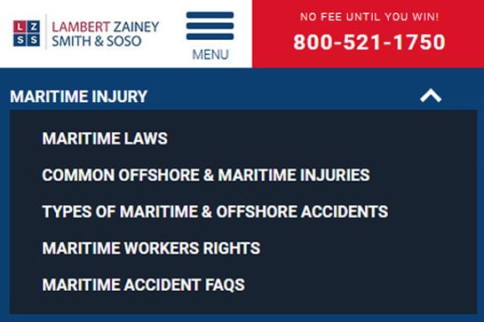
3. Easy-to-use Navigation
Easy-to-use navigation is a crucial element of a good mobile-friendly website for a law firm. It ensures that visitors can easily find the information they need, improving their overall user experience. By implementing clear and intuitive menus, incorporating search functionality, and organizing content in a logical manner, you can create a seamless browsing experience for prospective clients.
A well-designed navigation system also helps search engines understand and index your website’s pages more effectively, contributing to better visibility in search results. Offering easy-to-use navigation is essential for keeping visitors engaged and increasing the likelihood of converting them into clients.
4. High-Quality Content
When it comes to mobile-friendly website design, high-quality content plays a crucial role in engaging and converting prospective clients. By providing valuable information, such as practice areas, consultation services, legal expertise, and case studies, you can establish your law firm as a reliable source of information.
5. Client Testimonials and Case Results
Client testimonials and case results are powerful tools for showcasing the success and credibility of a law firm. By sharing stories of satisfied clients and successful cases, prospective clients can gain confidence in the firm’s abilities and make an informed decision.
These testimonials provide social proof and demonstrate the firm’s expertise in various areas of law, such as personal injury, corporate law, or criminal defense. Additionally, case studies allow potential clients to understand how the firm approaches complex legal matters and achieves favorable outcomes.
6. Click-to-Call Button
Make it effortless for mobile users to contact your law firm by incorporating a click-to-call button. Enhance accessibility and convenience for potential clients, boosting conversion rates through a seamless connection. Improve user experience with a simple and direct call-to-action, maximizing the effectiveness of your mobile website design.

The Role of Content in Mobile-Friendly Attorney Websites
Informative and engaging content plays a crucial role in law firm website marketing efforts. By providing valuable information, such as legal tips and insights, you can build credibility and trust with potential clients. Engaging content also keeps visitors on your site longer, increasing the chance of conversion.
Additionally, relevant and well-organized content helps improve search engine rankings and enhances user experience on mobile devices. Regularly updating your content demonstrates your expertise and keeps visitors coming back for more valuable information.
How to Optimize Content for Mobile
To optimize content for mobile devices, it’s important to consider readability and user experience. Use short paragraphs and bullet points to make your content easily scannable. Incorporate relevant keywords naturally to improve mobile SEO.
Break up your content with subheadings to enhance navigation. Optimize images and videos for faster loading on smartphones. Ensure legible font sizes and clickable buttons on smaller screens.
By following these practices, you can optimize your content for mobile and provide a seamless browsing experience for your audience.
Mistakes to Avoid When Designing a Mobile-Friendly Website
When it comes to mobile website design, there are several mistakes that law firms should avoid.
Mistake #1: A Cluttered Interface
To design a clutter-free mobile website, it’s important to prioritize essential information and streamline the layout. Effectively utilize white space to improve readability and reduce visual clutter.
Organize content into logical sections with clear headings and subheadings, making it easier for users to navigate. Minimize the number of visible elements on each page for a cleaner look. Prioritize key features and contact information for easy access by prospective clients.

Mistake #2: Slow Load Speed
To ensure a smooth user experience on your law firm’s mobile website, it is crucial to address the issue of slow load speed. Optimizing image sizes and formats, minifying CSS, JavaScript, and HTML files, as well as using caching techniques can significantly improve load times. Compressing files and enabling browser caching also contribute to enhanced performance.
In some instances, it may be necessary to hide large images and reduce the amount of elements or content that shows on the mobile version of a page in order to maintain faster load times.
Mistake #3: Lack of SEO
To ensure the success of your law firm’s mobile website, it is crucial to address SEO issues. Conduct in-depth keyword research to identify relevant terms that will resonate with your target audience. Optimize meta tags, headers, and content by incorporating these targeted keywords.
Improve the overall structure and internal linking of your website to enhance search engine visibility. Leverage local SEO strategies to attract clients within your geographical area, such as claiming and optimizing your law firm’s Google My Business listing, including local keywords in your content, and obtaining quality backlinks from reputable local directories.
Get Started with Your Law Firm’s Mobile-Friendly Website
Need help building a mobile website for your law firm? Thunderhead Marketing has you covered! At Thunderhead Marketing, we understand the importance of creating a seamless user experience for your law firm’s website. Contact us today to learn more!