In the SEO game, we talk a lot about the importance of strong content. It should be informative. It should be well-written. It should be thorough. However, very little of that matters if no one can find this amazing content when they come to your site. Website navigation is the roadmap that guides users to the information they need.
When designing a website, there are many ways to structure this roadmap. Below, we break down 10 types of navigation and when they should be used in your law firm’s website design.
1. Horizontal Navigation
This is what most people would picture when asked about website navigation. It’s usually located on every page of the website and consists of links to top-level pages. For a law firm, it may include links to your “about us” page, main practice areas page, blog, case results page, and contact us page. It also typically includes your logo and CTAs (calls-to-action) such as a phone number or a button to submit a form.
A Word About Paid Advertising Landing Pages
Paid advertising landing pages, such as a pay-per-click landing page, may not have a classic horizontal navigation as studies have shown conversion increases if you limit the actions a user has once they land on a targeted page. You might still use horizontal navigation for a landing page but have fewer link options than what you would find in the website’s main navigation. Or you can use it as “local” navigation that takes users to content located elsewhere on the landing page rather than to a different page altogether.
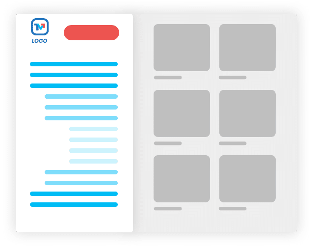
2. Vertical / Sidebar Navigation
Vertical navigation used to be more common before mobile devices became a leading source of website traffic. Although not as common today, you may occasionally come across a website that uses a vertically stacked menu in a left-side sidebar as the website’s primary navigation.
These days it’s more common to see sidebars being used to squeeze more useful information above the scroll line on desktop screens, like on a blog post. You may want to provide links to other blog categories, ebooks, social media, special offers, or other CTA’s.
A newer trend that we actually love and want to see more of is using the sidebar for local navigation, such as a table of contents, which allows users to more quickly bounce around to content on the page that is relevant to their needs. More on local navigation below. A powerful combo is making the sidebar sticky when it has a table of contents in it.
3. Secondary Navigation
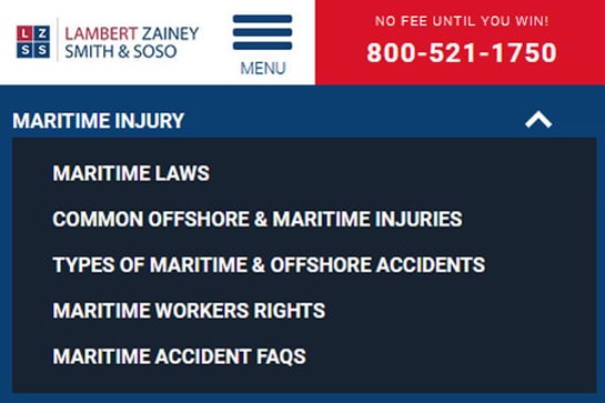
Secondary navigation can be used for content that is of secondary interest to the user, but still relevant to the area of the site they are interacting with. For example, if a user is on a maritime section of a law firm’s website, the secondary navigation might have links to pages about maritime laws, a maritime ebook, common maritime injuries, recent maritime case results, etc.
This is one of the types of website navigation that should be used sparingly and always as part of a user’s journey, helping steer them toward conversion. Remember, minimizing the number of potential actions a user can take on a page makes it easier for them to quickly scan the options and decide what they should do next, which can boost conversions. This type of navigation should be designed to appear less prominent than the main horizontal navigation.
We’ve also seen some websites use secondary navigation as local navigation and even have it in their sticky navigation.
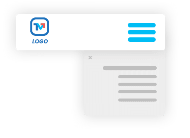
4. Mobile/Hamburger Menu
The hamburger menu icon gets its name from the three horizontal lines that make it look sort of like a hamburger. It’s considered a universal standard that the icon means “menu.” When expanded, the hamburger menu generally displays a stacked version of your main navigation.
While some law firms use this for desktop and mobile versions of their templates, we recommend using this only for your law firm’s mobile website design, such as tablets and smartphones. Using descriptive navigation labels is always a best practice for usability when working with navigation. Hiding everything behind the menu icon is expected on mobile devices but can hurt you on desktop, where you have more screen size to work with.
5. Utility Navigation
Utility navigation refers to the often secondary actions or tools that most website users would care about. The utility navigation can include options such as site search, login to a client portal, language/location switcher, and more. As a user visiting a law firm’s website, you may be interested in any of those actions, regardless of whether you are on a maritime page or a car accident page.
Typically, utility navigation is placed above the horizontal navigation, aligned to the upper right corner. That is where users expect to find it and that is where you should put it.
6. Footer Navigation
Footer navigation usually includes many of the same options found in the main horizontal navigation and/or utility navigation. This typically doesn’t include any items that would be found under a drop-down menu, but you could cherry-pick key items that you may feel users may be interested in if they make it down to the footer of your website. Website visitors often scroll straight to the bottom of a website when they need things like a phone number, address, or customer support. Research has shown that mobile users are more likely to make it down to the footer section of a website.
It’s also a great place to house your social media links, sitemap, copyright, privacy policy, and disclaimers.
7. Drop-Down Menu
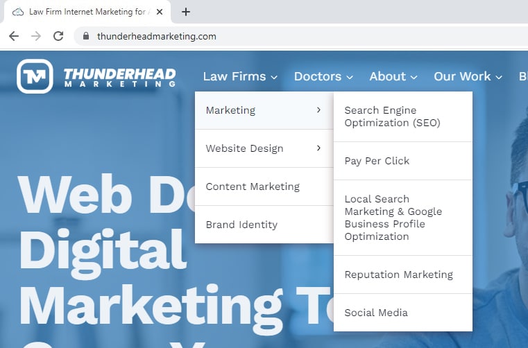
Drop-down menus are another of our favorite types of navigation for attorney websites. They are a helpful way to organize complex lists of pages that would otherwise be impossible to fit in a standard horizontal navigation but also overload the user with too much info and clutter.
A law firm might have a dropdown for their practice areas, locations, or attorneys. Or they may make their main navigation focused on specific practice areas. In this scenario, there might be dropdowns for personal injury, family law, and criminal defense.
Usability studies show that those little drop-down menus can be frustrating for a user, so make sure the groupings are relevant and that it is coded to function well across different devices/screen sizes.
8. Mega Menu
Mega menus are drop-down menus that span the whole width of the main navigation or more. This is one of the types of website navigation that may be preferable for big sites with lots of pages and many practice areas. Because it opens up how much room you have to guide the user, mega menus are a great way to add descriptive text, multiple columns, icons, calls to action, and even images.

9. Sticky Menus
This navigation trend has grown quite common since it is so helpful to the user when done correctly. A sticky menu keeps the horizontal navigation at the top of the screen while the user scrolls up and down the page. Personally, we prefer when the navigation collapses into a smaller, more condensed version so that it isn’t covering up precious screen space.
It’s also a great way to have contact info stay in the top right corner of the screen, regardless of where the user is.
Local Sticky Sidebar
As mentioned above in the vertical/sidebar section, adding a table of contents to a sidebar and making it sticky is a great way to add some convenience to users reading your longer content, such as blog posts.
10. Breadcrumbs
Breadcrumbs help the user understand where they are on a website by visually showing them the hierarchical structure of your website. They typically appear horizontally, between the navigation and page title. They show users, who may be deep into a website’s structure, how they got there. Many times someone will enter the site on a deep page if it is ranking well on Google search. Breadcrumbs can help the user get their bearings and easily navigate to a parent page.
Need Help Navigating Your Website’s Navigation?
Thunderhead Marketing works with law firms across the United States to design websites that are pleasing to the eye, search engine friendly, and easy to navigate. Contact us today for a quote.

