Website navigation is arguably one of the most important elements of a law firm’s website design. Quality content is the most important element since it is what will give your website purpose, meaning, and worth in the eyes of your prospective clients and Google. Navigation is what organizes all that content in a helpful, consistent manner, allowing the website’s users to experience the least amount of friction and frustration when looking for the information they need. The User Experience of your firm’s website has a direct impact on your website’s Conversion Rates, Bounce Rates, % Exits, etc. and ultimately could cost you clients if neglected or implemented improperly.
Below you will find some helpful tips and best practices to keep in the back of your mind when developing your law firm’s website navigation. You will also find pictures and descriptions of common variations of website navigation, along with examples from real law firm websites.
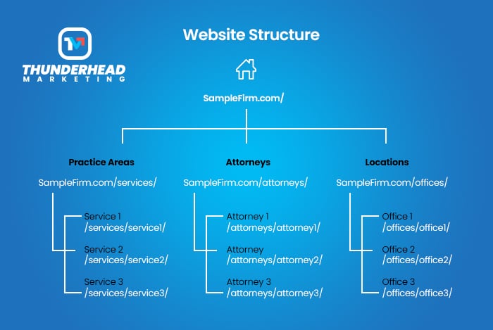
1. Think About Site Structure / Site Architecture
Website structure is how a website groups its content (posts/pages). When planning a website’s structure, it is common to consider what the URL structure will be. Often the navigation will somewhat mirror the URL structure.
It is rarely a good idea to betray the expectations of your law firm’s website users. Some design choices have withstood the test of time by proving to be the most optimal for a user’s experience. If you have ever been to a website that was designed to look and function very differently from conventional websites, you may have found there was a bit of a learning curve to figuring out how to best navigate that site. It can be downright frustrating to the point where you hit the back button to go find a site that works the way you expect it to.
Some examples of website navigation design norms are:
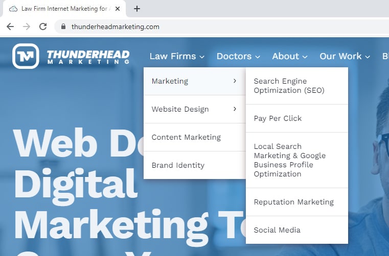
- Keeping the logo on the left side of the screen.
- Making the logo itself a clickable link that takes the user back to the home page.
- Keeping contact info and Call-To-Action on the top right.
- Using a hamburger icon (which looks like this: ☰) on mobile devices for the main navigation.
- Having “active” links that show the user what sections of the site they are on. Creating styling that stands out from non-active links to achieve this effect. It could be as simple as bolding the words that are linked (we call this the anchor text) or changing the background color.
3. Use Descriptive Navigation Labels
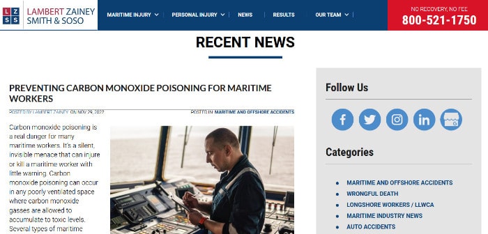
Your law firm website navigation should help the user drill down to the content they care about. Sometimes it makes sense to get more descriptive with navigation labels. Using narrow topic labels rather than broad topics and formats can help with the user experience as well as search engines.
For example, for a probate and estate law firm:
Avoid broad formats:
- Articles
- Videos
- Whitepapers
Avoid broad topics:
- Wills
- Probate
- Trusts
Use narrow topics:
- Will Contests
- Probate Litigation
- Trust Administration
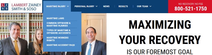
4. Have a Clear Call-To-Action / Contact Info In the Header & Make it Pop!
One of the most important actions a user can take on a law firm’s website is to fill out a contact form or call the phone number. Visitors who are ready to engage with your law firm will often look to the header of your website for an easy way to get in touch. In fact, research shows that around 55% of all marketing websites feature a contact button in the top right-hand corner, making it an established standard for web design
Make sure the phone number and button to the contact form are where the users expect them to be. Use colors with high contrast to help it stand out at-a-glance.

It’s also a good idea to keep your Call-To-Action visible on a sticky menu as the user scrolls up and down your website on desktop and mobile devices.
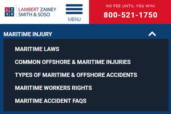
5. Group Links When There Are More Than Seven
It can be harder for a user to scan and retain information when there are too many items to visually and mentally process. Even if your navigation is using techniques like drop-down menus to manage the amount links in the navigation, large sites can still overload the user by crowding the User Interface or even breaking it if there is too much info to properly fit the display size the users are viewing the site in. Try to cluster navigation into groups of seven or less wherever/whenever possible.
6. The Order of Links Are Important, Especially First and Last Positions
This tip can piggyback off of the above tip since it mainly applies to users processing information in long lists, like drop-down menus. It has to do with the serial-position effect in which attention and retention is the highest at the beginning and end of a list. So keep your most important pages at the beginning and end of your drop-down navigation when applicable.
- Primacy effect: Items at the beginning of a list are more easily remembered.
- Recency effect: Items at the end of a list (or something that just happened) are more easily remembered.
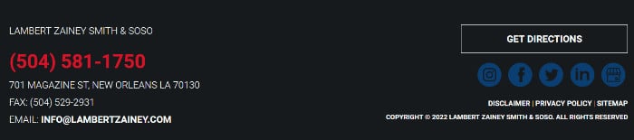
7. Keep Social Icons Out Of The Header
It seems like a good idea to drive more traffic to your social media accounts by promoting them in an area of your website that has good visibility and prominence. But ask yourself if you really want to increase the chances of sending potential clients to some of the most distracting corners of the internet where they may get lost down the rabbit hole before they have reviewed your content and had strong exposure to your Calls-To-Action and contact info.
It’s much better and more common to promote your social media accounts in the website’s footer section and on blog posts.
8. Make the Phone Number Clickable
If you want prospects and visitors to contact you by phone, make sure your law firm’s phone number is clearly visible in the top right of your website and be sure to have someone readily available to answer those calls and questions. These days, a large amount of website traffic is coming from users on mobile devices. This is why you need to make sure that the phone number is a clickable link, where the link follows this format: tel:123-456-7890 or tel:1234567890. This will allow a mobile user to tap the phone number to easily make a call from their mobile phone.
9. Use Site Search If You Have a Big Site With Lots Of Pages
Some law firms have massive websites with lots of practice areas, lots of attorneys, and/or lots of locations. Having a clearly visible site search functionality can be a huge time saver for your website’s users to drill down to the pages they are interested in.
Stick to universal design norms, such as using an icon of a magnifying glass to show the user where your site search is. If you don’t have a lot of room, you can have the icon in your main navigation that when clicked triggers a drop-down input box for the user to type what they are looking for. Another common placement is in the utility navigation area. Including the magnifying glass inside of the search input box helps make it easy to spot with a quick scan of the header. Use “Search” as placeholder text in the input box for an added layer of description for the user.
On mobile, a good place to put your site search is right at the top of mobile navigation once the user clicks on the hamburger icon.
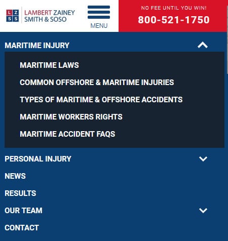
10. Use Arrows / Carrots to Indicate Drop-Down Menus
Arrows and carrots are a great way to indicate places where users can find more information. It’s a common best practice to have the arrow or carrot point the direction the sub-navigation menu will appear. For desktop, the main navigation tab should point down. If there is yet another drop-down menu nested under this one, it may point to the right. For mobile, it is a good idea to have the arrow flip to up once a drop-down has been expanded, indicating that clicking the up arrow will collapse that drop-down menu. This will conserve precious screen real estate and reduce the need for scrolling in your mobile navigation.
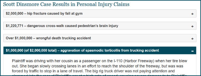
A Note About Plus / Minus Signs
We have seen some sites use plus and minus signs rather than arrows or carrots. Although this does make sense on mobile navigation since the user is expanding and collapsing navigation objects, you should strive for a similar user experience across multiple devices. If you decide to go with using pluses and minuses, code the desktop version of your navigation’s dropdowns to only appear and disappear when clicking the parent navigation for the dropdown rather than simply hovering on and off with your mouse.
Personally, I prefer using pluses and minuses for accordion sections of information, such as FAQ sections or case results.
11. Keep Your Sticky Navigation Short. Save Space Where you Can, Especially on Mobile.
You’ll find more information on sticky navigation below. For now, it is worth mentioning that you don’t want a tall sticky navigation that takes up too much vertical space since it stays with the user as they scroll up and down the website.
Resize / Hide Your Logo on the Sticky Navigation
If your sticky navigation is looking cramped and crowded, having your logo in your sticky navigation doesn’t add much value to the user other than providing an easy way back to the home page. If you are adamant about keeping the logo in the sticky navigation, make sure you shrink it so that it isn’t making the sticky navigation taller.
You can also swap the logo out with a home icon in your sticky navigation to save space.
Use Icons to Save Space in Your Sticky Navigation
This is especially true for mobile sticky navigation. Users are used to seeing icons to interact with on mobile devices. You can use a clickable phone icon to replace your phone number. You can use a clickable envelope icon for your contact form as well.
12. Keep Utility Navigation Placement Top Right of the Website
Utility navigation consists of secondary actions that strongly affect website visitor satisfaction, user experience, and engagement. These should always be positioned on the very top right of the website. De-emphasize them visually from the main navigation and Call-To-Action.
Here are some common examples of what a user might find in a website’s utility bar/utility navigation:
- Contact us
- Locale/Language tools
- Log in/Client portals
- Subscribe
- Tools for changing font size
- Site Search
- Save
- Share
13. Make your Drop-Down Menus Easy to Use
There are many ways to style your drop-down menus so that website visitors find them easy to use. Here are some good design practices to keep in mind when styling your law firm website navigation:
- Make sure there is plenty of padding around the labels.
- It’s a good idea to use a divider, such as a line, if you have labels that take up two or more lines. This will help the user not accidentally click the wrong link.
- The whole link area should be clickable, not just the text.
- Keep background colors in mind. For instance, if your site has a white background and your dropdown has a white background, the user might hover outside of the drop-down navigation because they can’t tell where the edge is. This would cause the user frustration as the dropdown would collapse. Simple adding a border to the dropdown or giving it a different color would fix this issue.
- Make sure the “hover” styling of any links change as the user hovers over them. This could be text color or background color changing to help them see which object the are interacting with.
Get Help With Your Law Firm Website Design
For more than 14 years, Thunderhead Marketing has designed websites for attorneys across the US, helping them to grow their brand with fast, professional, up-to-date, and secure sites. Whether you are looking for a fully custom attorney website or one of our semi-custom templates for lawyers on the go, we’ve got you covered.